Level Access
Streamlining the creation of pages with the creation of a design system
Design system | Accessible design | Responsive design

Level Access offers a suite of products to help companies evaluate their accessibility and provides recommendations to address existing issues.
As it experienced rapid growth, the complexity of its product suite increased. Recognizing the need for scalability, consistency, efficiency, and the necessity of being accessible (as an accessibility company), we embarked on creating a design system to provide a centralized library of reusable styles, components, and guidelines for designers and developers.
My contribution
As a sole designer, I led the entire design of the initial 10 components of the design system from conception to completion.
I collaborated with the project manager, developers, and accessibility experts to built and document the components. Then with each designer to incorporate the new components into the existing product.
Understanding the current state of the components
How are pages built currently?
I conducted audits of the current components to understand their state and discovered:
-
Discrepancies in the visual appearances (colors, paddings, fonts) within the same type of component,
-
Inconsistencies in the placement of the components across different pages,
-
Variation of labels,
-
Discrepancies in states visualizations.


For example, the color used for primary buttons was a medium blue, the audit revealed 13 different HEX codes in the CSS which were 8 different shades of medium blue. The color chosen was tester on white background to start. Later in the creation, new backgrounds were needed and this color was retested to reach at least AA compliance.
Also, I discussed with designers and developers to understand their creation process which gave me some great insights:
>> The product teams work in silos
Flows and elements were recreated over and over depending on the need for it without looking at the holistic product. This was happening on the design side as well as the development side.
>> No centralization of the components
Designers and developers were copying /pasting elements from one page to another, without reusing the same element across the product.
>> A limited knowledge of accessibility
While Level Access provides accessibility evaluation, their own product was not fully accessible.
>> A limited usability of the product on tablet and mobile
The product was designed to satisfy only desktop users.
>> The lack of visual QA
This activity was not part of the Definition of Done and even more discrepancies were seen between the design and the coded page.
Designing the components
Starting the design library
To see results faster, it was decided that the first iteration of the design system would follow the current style and make it consistent and accessible first. This would allow to have minimal visual changes now for the clients used to the current platform and be able to change elements faster in the future.
As an MVP for the design system, we decided to create all the components included in the complex component that we called Toolbar, containing 10 components largely used on the product.
That way, the product would get a nice evolution already.
A constant back and forth
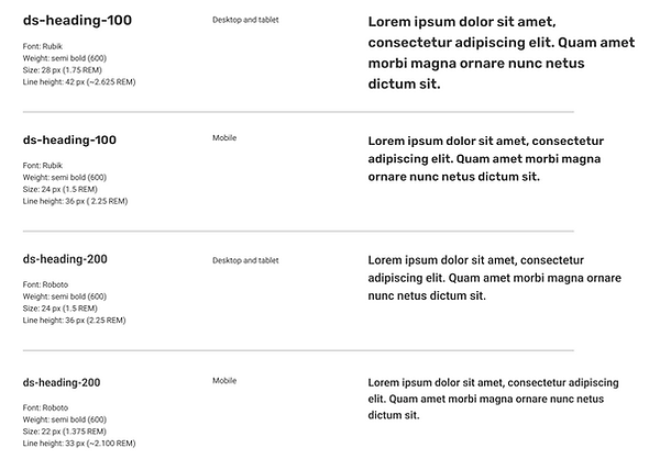
Working with the audits, I looked for common elements to the different components in order to build the tokens and guidelines.
For example, the medium blue used became the interactive color of the platform used for buttons and links.
For the first iteration of the components, I was going back and forth between the components, the tokens, and the guidelines, building the library with a systemic mindset.
In parallel to the creation of tokens and components, I had a weekly check-in with the director of accessibility design to make sure of the accessibility aspect of the components.


Documenting the system
Preparing for development
The design library was the first step of the design system journey and it was time to start developing the components.
I consulted first with the front end developer to make sure the design decision made so far were working for them as well. This led to rethink some elements that could affect the design system in the future or take too much time to develop for an MVP:
-
The naming convention was not optimal for a design system because it was not scalable. This led us to rethink about how to name our tokens in order to be able to evolve the design system later (i.e.: the color for the call to actions changed from eap-blue-interaction to $ds-color-interactive).
-
The focus indicator for radio buttons and check boxes which needed to follow the browser requirements (highlighting the button or the checkbox, without the label) instead of the best practices (highlighting the button/checkbox and its label). However the recommendation was documented for future implementation.
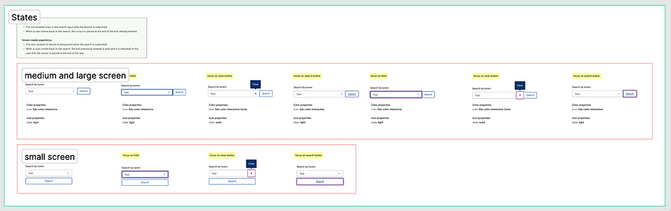
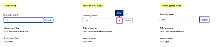
Then, I created the design requirements providing the tokens, the components used, and the behaviours for the 3 breakpoints chosen for our design system.
In term of accessibility, I worked with an accessibility SME to agree on the behaviours.
Finally, when the components were developed, I did some visual and accessibility QA to ensure the accuracy of the implementation.
What happened then?
In parallel, I collaborated with each designer to help them integrate the new components to their part of the product. This activity unveiled new use cases that needed to be added to the components.

Wrap-up
Looking back at the project
What was the impact of this project?
-
One single source of truth: It created a more consistent product, in term of visual and interactions.
-
A more accessible product: Accessibility being built into the components from their creation, the new features were ensured to be accessible.
-
A faster creation process: Having a ready to use library of accessible components allowed designers and developers to focus on creating great experiences.
-
A more scalable product with a possibility to make one change and spread it to the entire product.
-
The communication facilitated between designers and developers thanks to a common language.
What made it successful?
-
Bi-weekly collaboration with the design team to present the new components or features where I also took their feedback and needs for new elements in order to evolve the components. It was a collaboration between my holistic approach and their product oriented approach which was very instructive.
-
Weekly meetings with the design accessibility Subject Matter Expert (SME) to discuss about my design were a must-have to ensure accessibility. I was able to ask her questions about the challenges I was facing and validating designs to make of the accessibility of the components.
-
Punctual meeting with the functional accessibility SME also taught me a lot because it was with a different lense. It make me discover some functionalities I was not aware of.