Canada Post
Designing a responsive and accessible template for the table component
Table design | Responsive design | Accessible design

CanadaPost provides a comprehensive repository of documents intended to guide customers in utilizing their services effectively, including service requirements, permissible and prohibited items for mailing, or addressing guidelines.
Historically, these documents were optimized for printing and distributed to customers in PDF format. However, this approach became inaccessible and challenging to update efficiently.
The presentation of the information in these documents uses a large number of tables of different shapes and type of content. As a specific component, the redesign of this element was isolated.
My contribution
I designed the new table template that could be used for all the tables, ensuring their layout is consistent, scannable, accessible, and responsive, but also that they can be printed.
For its implementation, I collaborated with the front end developer to ensure its feasibility.
Understanding the problem
Why should the tables be redesigned?
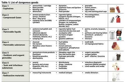
The inventory of all the tables counted around 350 different tables, with different types of data (i.e.: prices, descriptions, postal codes, measurements,...).
By auditing the tables I was able to highlight that:
-
The table format was not always necessary to present the information,
-
The layouts were not visually consistent with different spacings, colors, and information provided (i.e.: mentioning the unit in each cell or above the table). Due to the fact that each table was created from scratch by its owner, without following any template.
-
Reading the tables was not predictable and the user needed to think about how the table works for most of them,
-
The large amount of information in some tables was increasing the cognitive load of the users, and made it very complicated for screen reader users,
-
Accessibility and responsiveness were not considered at the time the pages were designed.


Continuing to create tables this way was not scalable so we defined objectives for the redesign:
-
Consistency, to help the user going through the information without having to learn how to read the table each time
-
Scanability, to allow the user to find the information they are looking for at a quick glance
-
Accessibility, to provide the information to everyone
-
Responsiveness, to allow the consultation of the table on any device
-
Printability, to provide remote post offices with the information they need.
Looking for the solution
What are the standards for table design in term of usability and accessibility?
Tables can be found on many websites, used for different types of information and I looked at different industries to find inspiration: retail (i.e.: size chart and feature comparisons), banks (i.e.: feature comparisons), and other delivery companies to study how they presented their tables.
I was also looking for some useful features that could be added to the table to facilitate their navigation. Such as a toggle for the table units to avoid the double units in the table directly or also the highlighting of the entire column and row of a cell to associate it easily to their headers.
Finally, articles about best practices on tables for usability and accessibility gave me insights to create our own set of guidelines for the future tables:
General
-
Each table has a mandatory descriptive and concise title (accessibility)
-
Units of measurement are mentioned in the title when possible to avoid crowding the column headers
-
The first row contains the determining information
Content
-
The content concise and scannable (accessibility)
-
Avoid redundancy
-
Use unit toggle outside the table to switch the data in the table
-
Avoid comments in cells
-
Roll over the content instead of truncate (accessibility)
-
Each column has a header (accessibility)
Alignments
-
The columns are sized according to the data they contain (No stretching the entire width of the screen)
-
Text aligns on the left
-
Numbers align on the right (not implemented)
-
Use same number of decimal on related numbers
-
Booleans, dates, phone numbers align on the middle (not implemented)
-
Column headings align with corresponding data (not implemented)
-
Column header aligns to the bottom
-
Cells content align to the top
Designing the solution
What does the new table experience look like?
1. A single visual language
The visual language was created to use on all the tables, taking into consideration padding, lines, cell background, font size and weight, as well as alignments.
It would make the information clear for every user, taking accessibility into consideration with contrast ratios, amount of information, layout for easier scan...
2. A limited amount of templates
To ensure their adoption, it was essential to limit the number of templates.
With the help of the repository, I concluded that most tables could fit into templates between 2 and 6 columns. Also, the type of data could differ between 3 types: small data (e.i.: price or weight), long data (e.i.: descriptions), and comparison tables.
3. A usable mobile version
The biggest challenge was to create the templates accessible and easily readable on mobile. The traditional horizontal scroll was a common practice but not a good experience for anyone so I wanted to avoid it.
My research pointed me to a new design of table that would require more development work but provide a good user experience. I sketched quickly my idea for multiple templates and the pattern worked. I presented it to the development team to validate its feasibility and they accepted to develop it.
The idea was that on desktop, a table would be presented like a traditional table, with columns and rows, while on mobile, the data would be presented into cards with advantages of:
-
Being easier to scan and read (only vertical scroll),
-
Allowing different types of content without unbalancing the page,
-
Providing the same experience for all users, on all devices,
-
Being more innovative with a true mobile approach.
4. Extra features
Specific features were also thought through to ease the usage of the tables such as a unit toggle, a postal code search, or a sticky header.
Example of a 4 columns table with short data
On tablet, the row headers take one column, the 3 other columns become rows repeated for each row header.
On mobile, the row headers are placed above 2 columns presenting the columns headers and their corresponding data.


Example of a 4 columns table with long data
On tablet, the row headers are placed above 2 columns presenting the columns headers and their corresponding data.
On mobile, each information is stacked on top of each other.


Implementing the tables
Creating the new tables blindly
Each table from the documents was looked at and these questions answered:
-
Is the presentation of the information make sense?
-
Which table template could be used to present the information?
The data of many table was re-organized in order to be more readable and/or scannable, dividing the information into multiple tables or flipping the information.
Without designing each table, instructions were given to the content authors who one by one created the tables in the CMS.
A thorough phase of visual QA with backs and forths for changes was required to ensure the tables were answering the requirements.
Some specific tables had to get a custom redesign because their format didn't allow the use the template.
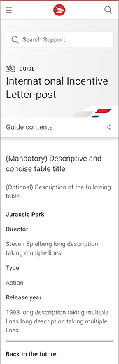
Before

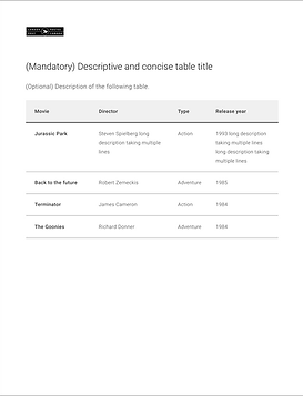
After


Wrap up
Looking back at the project
I am proud to have created a template that is used on the Canada Post website, and is today part of their design system. The mobile solution we implemented was a successful solution in term of usability and accessibility, which can be challenging for tables. I enjoyed creating the template in close collaboration with the front end developer.
What was the impact of this project?
By creating templates for the tables, authors can focus on the content of the table rather than how to present it. And then designers and developers can focus on on how to improve the overall experience.
For the users, the templates bring them consistency, readability, and more digestible information.