Form design
Helping customers to fill out their package's customs declaration with confidence
Client
Canada Post
Type
B to C
Role
Lead product designer
Team
1 product owner
Context
In 2022, 1.1M+ customs declaration were created with Canada Post online tool. This represent only 31% of the customs transactions. Leaving the remaining 69% to the post offices clerk to manually enter the customers data.
In order to facilitate the transactions, speed up the process, and gain information accuracy, it was imperative to rethink the customs declaration experience.
In this project, my role was to redesign the responsive experience to facilitate the customs declaration form completion and ensure its accessibility. I reviewed the research conducted by the research team, did some competitive and inspirational research, and collaborated with the mobile designer to align on a similar experience on the web and on the app.

Understanding the problem
Why customers do not use the online customs declaration form?
To find some answers to this question, I ran some activities:
-
Workshops with stakeholders to understand their business objectives and the current customer journey,
-
Performed an expert audit of the current experience,
-
Reviewed the qualitative research done few weeks prior on 19 participants,
and uncovered opportunities to improve the experience:
A lack of guidance
The information they need to provide is not clearly explained, the errors are poorly handled, and it is difficult to understand the next steps to take. All this conducting to more errors and frustration. The users have low confidence regarding the information to provide (such as the international address format, the content of their package, ...) and 50% of them would prefer to fill out the form with a clerk at the Post office.
Its purpose is not clear
Nothing indicates to the user why they should filling it out online (and not at the Post office). Also, the next steps to take are not mentioned which can be a source of uncertainty for the user, while they want their package to arrive at destination.
Not a great experience on mobile
The mobile version of the form is not optimized. However, the form is mostly used directly in the post office, making the mobile version the first device to be used for it.
The form is single-use
The form is meant to be used only once. Recurrent consumers need to fill out a new form for each package making the process time consuming. If lost, they need to go through the entire form again.
Ideating
How might we bring confidence to the user to fill out a stressful form online?
With the issues in mind, I did some research on other country's customs declarations, on stressful forms (such as taxes, banking...), and on accessibility best practices to find best-in-class experience that could be used to improve our form. As well, stakeholders, eager to fix the form, brought some good ideas during workshops:
1
Visual hierarchy
Dividing the form into meaningful sections and adding headings and labels to make sure user understand the different steps to take and where they are in the flow.
2
Progressive disclosure
Hiding the fields under accordions to avoid overwhelming the users with a long form and keep them focused on one step at the time.
3
Mobile first approach
Providing the best experience on the most used device.

4
Contextual information
Providing information in function of user's choice.
For example, with the recipient address, where the user choose the destination country first to get specific information such as possible delays and the address format.


5
Reinsuring content
-
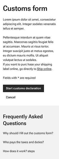
Adding an introduction screen to inform the user of what is coming up with a call to action and avoid them to jump directly at the form.
-
Providing an FAQ section always present at the bottom of the page.
-
Explaining why the fields need to be filled in an info icon.

6
Avoiding errors
-
Providing guidance on how to fill out the field directly above the field in order to reduce mistakes.
-
Pushing relevant information in case the user had forget to check. For example, the shipping restrictions in the selected country.
7
Multiple error validation
Validating the sections one by one (instead of everything at the end) and allow the user to handle their errors in context of what they just filled out.

8
Gain of time
-
Creating the review page after each section validation and allowing just a check at the end.
-
Allowing recurrent consumers to use the information from a previous form to send a new package.

9
Facilitating usage
-
Asking for an email address in order to send the QR code created.
-
Providing a code in case the QR code can't be read.

10
Saving for later
Allowing the users to complete their form at their convenience without loosing any information.

Designing the solution
Adding the visual layer to the new features
After a discussion with the engineering team about the new features, some calls were made to reduce the amount of work up front in order to have an MVP out as soon as possible and then adding the other features.


Wrap up
Looking back at the project
What was the impact of this project?
-
Every customers feels more confident in the information they provide while filling the form,
-
They spend less time at the Post-office when sending a package abroad,
-
The form is easily usable directly in the post offices
-
The form follows Canada Post branding
What made it successful?
-
The stakeholder workshops to gather business vision and feedback on the current experience,
-
The extensive qualitative research (serving as baseline) done few months before the design kick-off to understand how users experience the form.
-
The presence of a design system, making the last phase much easier and faster.
-
The discussions with the main stakeholder and the developers to discuss feasibility and find solutions together.

